Iowa offering new $5,000 homeowner grants to active military, veterans
QCBJ News Staff
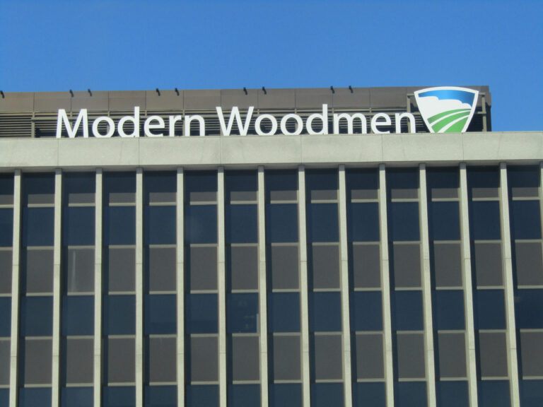
Modern Woodmen of America (MWA) has hit a home run with new signage – sporting its symbolic logo – atop its downtown Rock Island home office.
Crews recently installed the new signage on both the front entrance side and the riverfront side of Modern Woodmen’s home office at 1701 1st Ave. The new signage was part…

Get immediate, unlimited access to all subscriber content and much more.
Learn more in our subscriber FAQ.
Do you want to read and share this article without a paywall?